Multilayer CSS
Оригинальная, русская версия документации
Introduction
Multilayer CSS organization methodology is based on BEM and OOCSS principles. It was born in Odnoklassniki.ru developers team and is recommended for other developers as core for own documentations and team based methologies.
Despite the fact, that methodology was born in large project with more that 60 developers and manu inner services, it also can be easily used for small and medium sized projects.
English translation for MCSS documentation was prepared in a rush, for webconf.lv conference in Riga. Sorry for possible mistakes, we will update this document in the nearest future.
You can leave your questions in Issues section on Github or by email r@rhr.me.
Main principles
Pages are built from modules, every module must stay independend from parent context.
Modules are seperated to layers, with own rules of interaction.
MCSS doesn’t force using spefic code styles, you hust need to remember core methology rules.
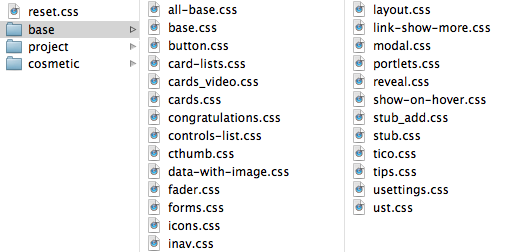
Style storing rules
All styles of specific module must be placed in seperate section or CSS file:
/* Module name
-------------------------------------------------- */
.module { }

.module_list { }
  .module_list__modificator { }
/* /Module name */
Modified selector with cascade, also are stored near other parent selectors:
/* Module name
-------------------------------------------------- */
.module { }

.module_list { }
    .module_list .other-module { }
/* /Module name */
The only exception is the context module:
/* Module name
-------------------------------------------------- */
.module { }

.module_list { }
    .touch .module_list { }
    .ie9 .module_list { }
/* /Module name */
Reset
Foundation includes resets and insignificantly changeable styles, which make up layout base and apply on all pages.
Foundation styles, as all resets, is applied first, or in separate file, or at the most top of the compound CSS file.
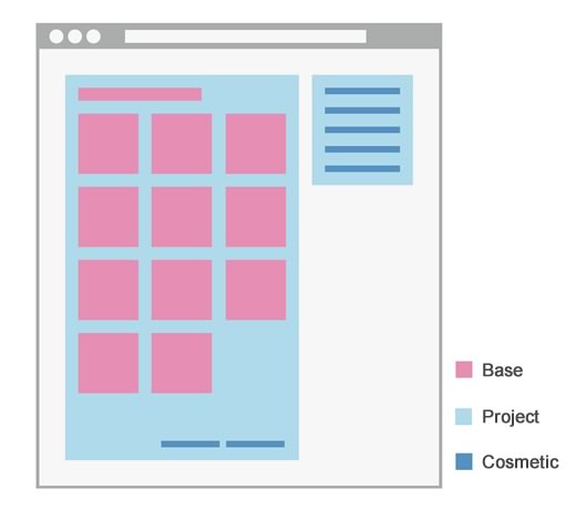
Module interaction scheme
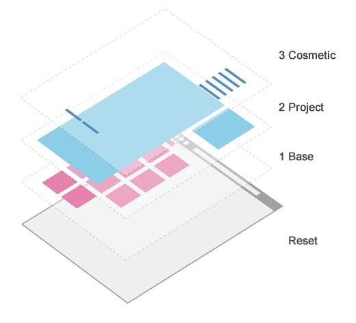
1 layer — base
First layer - is a portal framework, the core part of interface. It is based on reusable and abstract constructions:
- forms
- buttons
- navigation blocks
If you start to using MCSS, the first thing you should do - is creating a set of reusable standards.
As the part of the first layer you can use without a doubt so popular framework as Bootstrap, 960gs, inuit.css and others.
2 layer — project
Second layer includes isolated, project modules, which construct the page further:
- Registration form
- Login block
- Shopping cart
Rules
It is recommended to use as many as possible unique CSS classes in second layer layout; even if current design doesn’t need styling better practice is to assign unique CSS class to it. Such handling provides better availability of each separate layout block, what allows easily correct styles, without affecting HTML structure.
Each module has to be as isolated as possible and to exist as separate, independent item of portal, which interacts with the core / base layer only.
To use the first layer construction in project module, we need to assign one more CSS class:
<header class="toolbar">
    <a href="/" class="toolbar_logo"></a>
    <menu class="toolbar_dropdown_ul umenu">
        <li class="umenu_li"></li>
        <li class="umenu_li"></li>
    </menu>
</header>
Example displays second layer module .toolbar, which uses first layer standard .umenu. To modify standard for projet needs, CSS cascade is used:
/* Toolbar
-------------------------------------------------- */
.toolbar { }

.toolbar_dropdown_ul { }
    .toolbar_dropdown_ul .umenu_li { }
/* /Toolbar */
Example displays second layer module .toolbar, which uses first layer standard .umenu. To modify standard for projet needs, CSS cascade is used:.
This is right:
.project-module .other-project-module { }This is wrong::
.standard-module .project-module { }Benefits
Module isolation provides easy access to their styles, without fear of affecting other portal parts. When working in team, each member can develop one module, not conflicting with other developers.
Styles of each module may be applied only on the pages, where needed.
When portal turns off some functionality, it is easy to get rid of unnecessary styles - we need just to throw out one file or CSS block with corresponding styles.
3 layer — cosmetic
Third layer consists of simple, slightly affecting styles:
- links colors
- low-level OOCSS - two properties for CSS class (.font-size_XL, .margin-t_L)
- global modificators
Layer can not exist in some variations of methodology usage, but in big projects this layer allows to deal with styles cloning and to describe rare, non-project conditions, going ‘DRY’.
Rules
Third layer styles should be organized in a way to keep layout safe when we get rid of them. Losses should be minor e.g. colors, paddings…
It is allowed to use some of OOCSS classes, two classes for block maximum, for rare, non-project situations:
<div class="font-size_XL margin-t_L color_red"></div>Cosmetic layer styles can not be modified with cascade of other styles, except for context..
Cosmetic styles applied in the most end of CSS, also it is not allowed to use !important.
Benefits
Styles affect slightly on portal layout, dealing with code cloning and saving trouble of producing small project and base modules.
Project selectors allow to deal fast with rare situations, when we need to apply just a couple of properties for non-project module.
Context
This layer include styles of high context and @media-rules, that can be used for changing standard styles for features of different context:
- .ie8, .ie9 - browsers
- .touch
- .logged-in
- media-queries
/* Module name
-------------------------------------------------- */
.module { }

.module_list { }
    .touch .module_list { }
    .ie9 .module_list { }

@media screen and (max-width: 1000px) {
    .module { }
    }
/* /Module name */
Real life examples
You can check MCSS in action at this demo, all layers are stored in one CSS file, but could be also separated to individual files, like so:
In second demo, we have shown how MCSS works with Bootstrap, as first layer base.
Abbreviation dictionary
To escape large CSS selector names, we suggest using abbreviation dictionary:
i — item
tx — text
it — input text
ico — icon
t — title
f — footer
h — header
col — column
cnt — content
img — image
a — link
ac — action
usr — user
e — error
In future, dictionary will mo moved to separate documentation module.
Future of MCSS
- Internationalization
- Documentation seperation to independent modules
- Open source HTML specifications development environment
Stay tuned, and follow updates on @operatino_en
comments powered by Disqus